November 10th, 2024
Your Guide to 2024’s Top 10 Data Visualization Companies
By Connor Martin · 6 min read

At Julius AI, our goal is simple – to help you quickly visualize your data using artificial intelligence. We’re far from the only company in the data visualization and business intelligence field.
There are many others, with the 10 data visualization companies in this list each bringing something a little different to the table.
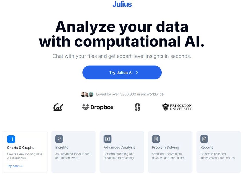
Julius AI
We start with ourselves. Using computational AI, Julius AI allows you to chat with the files you import into the platform. Think of it like a data analytics-focused chatbot. You enter a file, Julius AI interprets it in seconds, and then you ask questions to drive down to the expert-level insights you need to extract.
Variety is key with Julius AI. You get access to everything from simple tables to full-blown reports using an array of colorized charts to highlight the key information hidden within your data. It’s all done in seconds, too, which is likely why 1.2 million people and counting rely on Julius to help with data-driven decision-making.
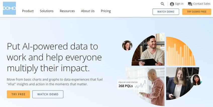
Domo
Sticking with AI platforms, we have Domo – a full-blown analytics platform that combines a collection of apps to deliver actionable insights into your data. It’s been around since 2010 and offers a low-code solution that empowers data integration, business intelligence, and much more.
Not every Domo app uses AI. For that, you’ll specifically need Domo.AI, which uses a chat interface to guide you through data prep and analysis.
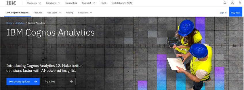
IBM
It shouldn’t be a surprise that one of the biggest players in the computer space is also a leader in the data visualization industry. Tools upon tools is what you get with IBM. Its Cognos Analytics platform is its AI powerhouse, offering advanced reporting and dynamic dashboards that feature informative visualizations related to whatever dataset you create.
Then, there are IBM’s courses and educational content – it’s as much a data visualization teacher as it is a visual analytics platform provider.
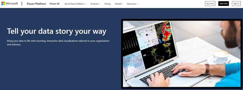
Microsoft
Like IBM, Microsoft is a major name in data visualization. It has been for years. Excel, Access, and PowerPoint have all provided data visualization tools for decades.
But we think Power BI – Microsoft’s AI-infused business intelligence platform – represents its next step up. Integrating with Copilot, the platform offers enterprise-level data ingestion and produces reports on potential business outcomes (and much more) that are scalable alongside your organization.
Tableau
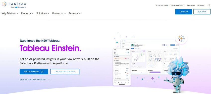
See, understand, and act on data. That’s the promise Tableau has made since its 2003 formation and it’s more effective now that it has two decades of experience under its belt.
Tableau is a broad analytics platform. That means it can connect to practically any dataset source from any software and still deliver insights. Throw in some artificial intelligence and machine learning capabilities and you get a company that’s been at the forefront of visual storytelling through data for a long time.
Insightsoftware
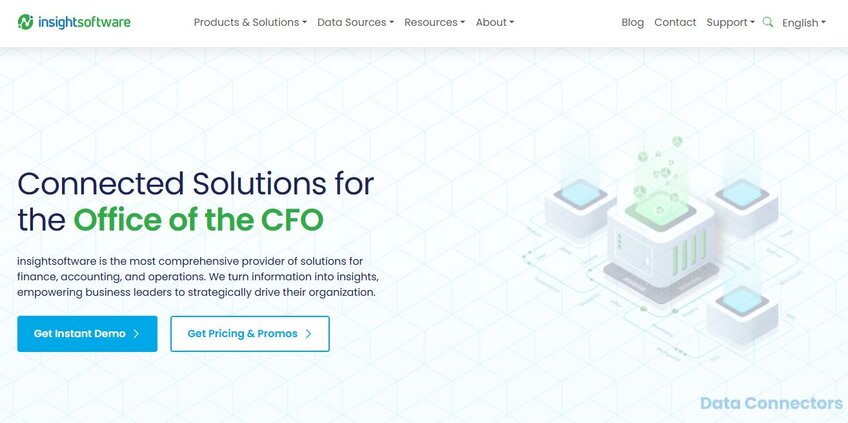
Insight by name and insight by nature. That’s the promise of Insightsoftware’s suite of data visualization tools, all of which are geared toward the financial sector. It offers data visualization for your company’s CFO and does it by helping you pull data from every warehouse, data stack, and cloud provider to which you have access.
Think of it as the ultimate data collator. The platform also offers pre-built logic and reporting structures for you to follow, all boosted by AI, so you get to the heart of your raw data.
ThoughtSpot
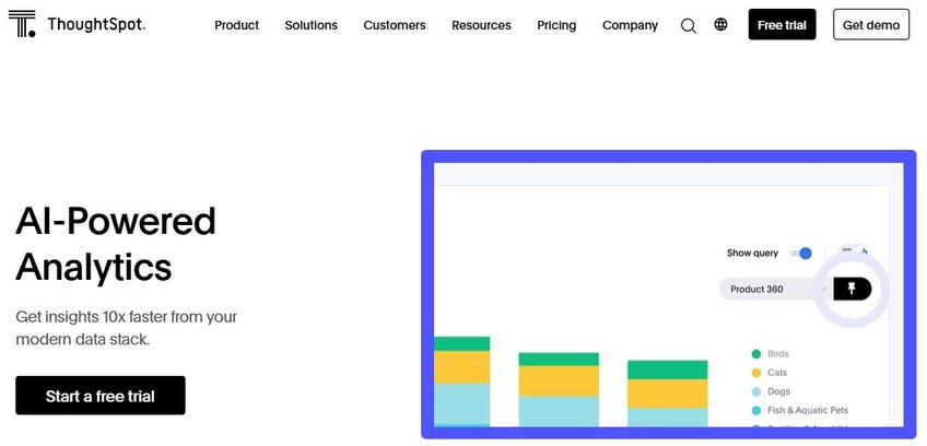
ThoughtSpot is one of the leading data visualization service providers because it keeps things simple. It handles the data you input in the background while providing you with a straightforward interface through which you can ask questions in plain English.
That’s the key.
By keeping things simple, ThoughSpot eliminates the coding and formulation that’s so often needed in data visualization. You ask and it answers via an AI-powered suite that can connect to CSVs, spreadsheets, and most cloud applications. It’s fast, too, capable of delivering insights in minutes that might otherwise take hours to generate.

GoodData
Another business intelligence (BI) platform that’s been around for a long time, GoodData has been helping its users make data-driven decisions since 2007. Versatility may be this company’s most attractive feature. You have the option to manage and query your data using a graphical user interface, as you get with most platforms. But the code-lovers among you can also build custom analytics systems within GoodData through its “Analytics as Code” feature.
Whatever path you choose, you’ll build real-time dashboards that show key data clearly while pushing you toward key metrics that impact your business decisions.
Qlik
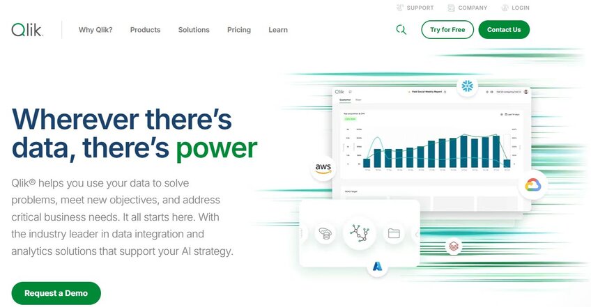
You and Qlik can transform raw data into visualized information in minutes. Granted, it’s not always that simple with Qlik as its output speed varies depending on the level of data integration you require. But there’s no denying its speed. The platform delivers analytics in real-time, with AI at the ready to generate useful reports as you need them.
There’s also a heavily automated element to consider. The Associative Difference tool can find associations between datasets you may have never considered. It also has the Accessible AI tool – a ChatGPT interface you can use to query your datasets.
Alteryx
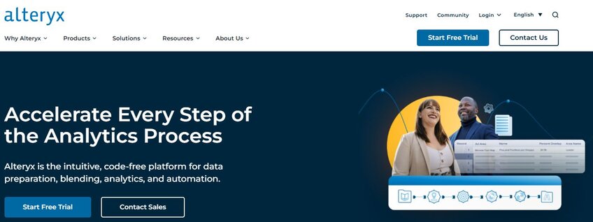
We finish our list with one of the old faithfuls in the data visualization industry. Alteryx has been around since 1997 and it’s lasted as long as it has because it’s never caught short when it comes to evolutions in data analytics solutions.
Today, it offers an AI platform focused on enterprise-scale analytics. That should clue you into whom this company designs its software. It’s a tool for the leader, be that the marketing, finance, or data science head in your business. And like all of the best data visualization companies, the Alteryx software suite can pull and blend data from a bunch of different sources.
Take Your Data Visualization to the Next Level with Julius AI
You only have one question to ask yourself – what do you need out of a data visualization company?
If your answer is operational simplicity combined with an AI infusion that takes your data visualization to the next level, Julius AI is the perfect choice. It’s as capable of pulling insights from small datasets, such as customer lists, as it is from complex files that appear on the surface to offer little more than reams of numbers. And thanks to its straightforward chat interface, getting reports and creating insights is as simple as asking the right questions. Try Julius AI today – expert-level data insights await.
Frequently Asked Questions (FAQs)
What are the big three in data visualization?
The "big three" in data visualization typically refer to Tableau, Microsoft Power BI, and Qlik. These platforms dominate the market thanks to their user-friendly interfaces, advanced analytics capabilities, and ability to integrate with large datasets to deliver actionable insights quickly.
What current business is using data visualization?
Businesses across all industries—from tech giants like Amazon and Google to financial institutions like JP Morgan—rely on data visualization. They use these tools to track performance, analyze trends, and uncover insights that drive data-driven decision-making.
Which programming language is best for data visualization?
The top programming languages for data visualization are Python and R. Python is widely used for its versatility and powerful libraries like Matplotlib and Seaborn, while R excels in statistical analysis and visualization for data-heavy tasks.
