November 4th, 2024
Financial Data Visualization Guide: What to Know in 2024
By Zack Fickenworth · 6 min read

Numbers upon numbers can leave you feeling like you’re adrift in a sea of data. That’s what it often feels like to be a financial professional in 2024 dealing with the nearly unfathomable amount of data your company generates.
How are you supposed to create reports? What about the financial insights you need to make product decisions or forecast the future of your company? So much of what you see is complex financial data that’s raw and unrefined, making it feel impossible to track financial metrics like revenue growth and cash flow.
Financial data visualization is what you need to navigate the sea of raw data your company produces. Discover how visualization helps with financial data analysis and which data visualization tools provide the most meaningful insights for professionals in the field.
Data Visualization in Finance
Why visualize financial data?
In a nutshell, visualizing the financial data your company produces allows you to identify patterns and highlight red flags indicating that something somewhere is going wrong. Even basic reporting on cash flows and revenue streams reveals where you’re making money and where process inefficiency – such as delayed invoice sending – might be costing your business.
Then, there’s the sheer volume of data your business generates to consider. Globally, we produce a staggering 402.74 million terabytes of data daily. Your business creates a small fraction of that data. But even that small fraction leaves you with a sheer volume of daily data creation that necessitates the use of financial data visualization tools. There’s so much data flowing through your business that it’s impossible to extract meaningful insights without them.
Common Types of Financial Data Visualization
You know why financial visualizations help you get to grips with the masses of raw data your company produces. But how do they do it? In other words, what are the most common types of financial data visualization and how can they help you to pull useful insights out of your financial data?
Charts
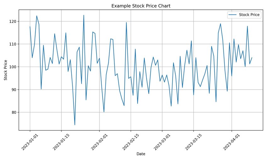
The humble chart has been a visualization machine for decades. For financial insights, there are few charts better than the line chart. These charts let you track time series data, meaning you can visualize what’s happening with a variable over a set time frame.
Let’s say profit is that variable. You can use line charts to track your company’s monthly profit over several years to see where it dips and rises. That visualization showcases patterns. Maybe profit drops during the same months for each year tracked, suggesting that’s a seasonable aspect of your company’s success.
Or there may be a downward trend over the years telling you that something has changed either with your processes or consumer demand. Charts help you visualize these patterns so you can take action based on what you see.

Tables
Tables are everywhere in the finance world. Every Excel spreadsheet you’ve ever created is a table and you use those spreadsheets because they allow you to organize large volumes of data by columns and rows.
Think of your tables as the basis for many of the other financial data visualizations you might create. For instance, you might pull data from multiple years’ worth of profit-tracking tables to create the line chart we described above.

Graphs
Think of graphs as a catch-all term for many of the charts and tables you’ll use to visualize your financial data. Line charts are graphs. So are bar charts – ideal for comparing values across periods to identify trends in your products and cash flow.
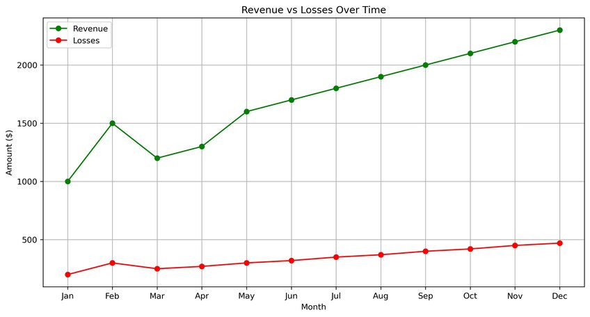
Graphs are also great as comparative tools for things like revenue and losses. A simple line graph comparing those two can show you when revenue exceeds losses – which should be the goal of your business – but also show you when there’s trouble. Thus, you get a visualization that points out periods where you’re losing money, allowing you to dig deeper into the causes behind those losses.

Maps
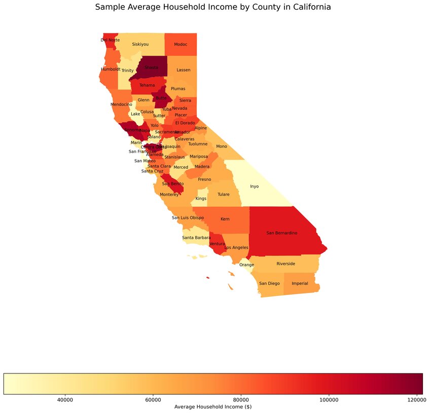
Maps come into their own when your company operates on the multi-region or multi-country level. Annotated maps are especially helpful. You can use them to display profits, losses, sales, revenue, and market penetration by operational region.
Again, you’ll start to see patterns. Regions that are doing great. Areas that aren’t doing so well. Some even use their maps to tie their financial performance to geopolitical issues, such as wars impacting trade routes, to determine why sales might be falling in a specific location.

Dashboards
Where graphs provide insight into trends and future issues you need to confront, dashboards are more about what’s happening in the here and now.
These visual tools allow you to consolidate data drawn from multiple sources into a simple interface. Often, that data is shown in near-real-time, such as an updated sales report you can track throughout the day. You might also use dashboards to track your company’s key performance indicators as well as using it to provide a route to your quarterly and annual reports.
Infographics
Simplifying the complex.
That’s the purpose of a financial infographic, which is a data visualization tool allowing you to link data point after data point in a diagrammatic fashion that’s easy for a viewer to digest. You might use infographics to explain complex concepts to clients or as part of internal presentations.
How to Do Financial Data Visualization Right
There are three things you need to consider when creating any type of financial data visualization – your goal, your audience, and your technology.
Insights can only be extracted from your data when you know what you want to learn. An example is pulling revenue figures for the past year demonstrated quarterly. That’s a goal because you know what you want to see. On the audience front, think about to whom you’ll present the insights you extract. The further away the audience is from the financial inner workings of your business, the simpler your chosen visualization has to be so they understand it.
As for technology, we have some ideas on how to make the best choice…
Make Financial Data Visualization Simple and Effective with Julius AI
Julius AI is unlike any financial data visualization tool before. You don’t need to know how to code or spend hours grappling with complex data to extract financial insights with the tool. Instead, we deliver an AI-powered chat interface that allows you to “talk” to the raw data files you upload to Julius AI. That chat feature makes presenting financial data easier than ever before. Just ask for what you want to see and our platform delivers reports and visualizations in seconds.
Discover why 1.2 million users trust Julius AI to provide expert-level insights about their datasets. Try it today.
Frequently Asked Questions (FAQs)
Which chart is best for financial data?
Line charts are often the best choice for financial data because they help track trends over time, such as revenue growth or profit margins. For comparisons, bar charts work well, while pie charts can showcase proportions like expense breakdowns at a glance.
How do you analyze and interpret financial data?
Start by defining clear goals, such as tracking cash flow or identifying revenue trends. Use tools like charts, dashboards, and financial KPIs to highlight patterns, outliers, or red flags. Once visualized, focus on the insights – understanding what drives your metrics and taking action based on what the data reveals.
What are the 3 rules of data visualization?
1. Clarity: Keep visuals simple and ensure they communicate a clear message.
2. Accuracy: Represent data truthfully without distorting scale, proportions, or context.
3. Relevance: Choose the right visualization type based on the audience and purpose, ensuring it highlights what matters most.
How to visualize a balance sheet?
Balance sheets can be visualized using bar charts or stacked bar graphs to show assets, liabilities, and equity side by side. Treemaps are another great option, as they allow you to break down and compare categories like current vs. non-current assets at a glance. Visualizing these components helps quickly identify the financial health of a business.
