September 11th, 2025
What Is Correlation Analysis? Common Mistakes & How To Run It
By Connor Martin · 10 min read

Correlation analysis helps me see whether two variables move together in a predictable way. I use it when I want to check if higher ad spend leads to more clicks, or if customer satisfaction drops when delivery times get longer.
In this guide, I’ll explain what correlation analysis is, how to calculate it without heavy math, and the main methods you can use. I’ll also share mistakes to avoid and examples you can apply to campaign results, financial checks, and operational data in 2025.
What is correlation analysis?
Correlation analysis is a statistical method that measures how two variables move in relation to each other. It tells you if they rise and fall together, move in opposite directions, or show no clear link at all.
For example, you might compare ad spend and conversions. If higher spend usually comes with more conversions, that’s a positive correlation. If higher spend comes with fewer conversions, that’s a negative correlation. And if ad spend doesn’t seem to affect conversions at all, you’d see no correlation.
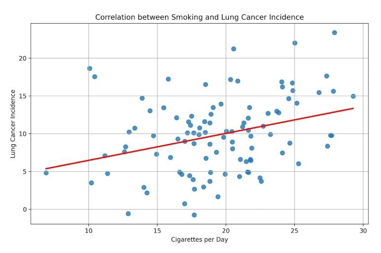
Here’s a scatterplot I made with Julius. Each point shows how smoking rates and lung cancer cases line up. You can see the general upward trend, even without a number attached. That’s correlation in action.

In practice, correlation analysis can lead to three possible outcomes:
No correlation: The variables don’t move in any consistent way.
Positive correlation: As one variable increases, the other also increases.
Negative correlation: As one variable increases, the other decreases.
That makes correlation a core method in data and statistical analysis, since it helps you quickly test whether relationships in data are worth exploring further.
Positive and negative correlations are the most common in real data, and they’re the ones that usually matter when you’re making business decisions.
Why correlation matters in business
Correlation analysis shows me whether a pattern of data is worth paying attention to.
In marketing, I’ve used it to check the link between spend and conversions or to see how engagement changes with ad frequency.
Finance teams use it to compare revenue and expenses to spot trends that raw totals miss. Product managers look at feature use against churn to see which actions keep customers longer. Operations teams track delivery times against satisfaction scores to understand service quality.
Overall, I like that correlation gives me a quick way to test assumptions with data instead of relying on gut feel.
Types of correlation methods
There are several ways to measure correlation, depending on the type of data you’re working with. Each method has its own use case. Pearson works best for continuous numbers, while Spearman and Kendall are better when you’re working with ranks or smaller sets.
Here’s a quick breakdown:

If you’d like to learn more about the three types of correlation methods, you can read more in our guide.
Pearson correlation
Pearson correlation looks at the strength of a linear relationship between two continuous variables.
It gives you a number called the Pearson correlation coefficient, which ranges from −1 to +1. A value close to +1 means a strong positive correlation, close to −1 means a strong negative correlation, and near zero means little or no relationship.
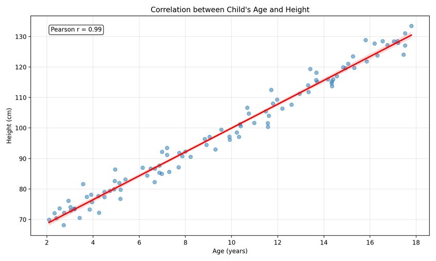
Here’s a scatterplot example from Julius that shows age and height. The points form a clear upward line, and the Pearson coefficient comes out close to 0.99. That tells me the two variables move almost perfectly in sync.

Spearman correlation
Spearman correlation is a statistical method that measures how well the relationship between two variables can be described by a consistent ranking, rather than by a straight line. That makes it better for ranked or ordered data. For example, you could compare product rankings with customer satisfaction scores to see if higher-ranked products tend to have better ratings.
Kendall correlation
Kendall correlation works in a similar way to Spearman but uses a different formula to measure agreement between ranked data. It’s useful when your dataset has many tied values or when you want a measure that’s more robust with smaller samples.
For example, if you’re ranking customer support tickets by urgency and two tickets share the same score, Kendall can still handle that tie. It’s also useful when you only have a small sample, like comparing how five sales reps rank different product pitches against the actual results.
When should you use correlation analysis?
Knowing why correlation matters is one thing, but the real value comes from knowing when to run it.
You should use correlation analysis when:
You suspect a relationship: For example, higher ad spend and more conversions.
You need evidence for a decision: Like whether delivery delays really affect satisfaction scores.
You want to test an assumption: Such as whether product usage keeps customers from churning.
You’re comparing ranked data: Like whether higher customer ratings connect with higher sales.
If your goal is to see whether two variables move together, correlation analysis is the right tool. If you need to predict one variable from another, that’s where regression analysis comes in.
When correlation misleads you
Correlation can reveal patterns in your data, but it doesn’t prove that one thing causes the other. I’ve seen plenty of examples where two variables move together but aren’t directly related.
A classic case is ice cream sales and shark attacks. Both rise in the summer, but eating more ice cream doesn’t cause more shark bites. The hidden factor is the hot weather, which brings more people to the beach.
The same thing happens in business data. You might see a positive link between marketing spend and revenue, but if you don’t factor in seasonality, you could think your ads are driving growth when it’s really just holiday demand.
Another trap is assuming correlation always holds over time. I once saw engagement rise alongside ad frequency, but past a certain point, the trend reversed. What looked like a strong relationship at first broke down when I checked a longer time frame.
That’s why I treat correlation as a signal, not an answer. It shows me where to look closely, but I still dig deeper before acting.
How to run a correlation analysis in Julius in 5 steps
When you want to check if two variables move together, you shouldn’t have to spend time exporting data or setting up formulas in a spreadsheet.
Julius makes this easier because you can run the whole check in plain language without leaving the tool. Here’s a flow you can follow:
Pick the variables: Choose two measures that might connect, like ad spend and conversions. You can type, “Show the correlation between ad spend and conversions for July,” and Julius pulls the numbers right away.
View the scatterplot: Julius gives you a chart so you can see the relationship at a glance. If you want more detail, ask, “Add the Pearson correlation coefficient to this chart,” and it overlays the number on top of the visual.
Compare the views: Sometimes the scatterplot tells the story on its own. Other times, the coefficient helps you explain the strength of the link to your team. Switching between the two takes one request.
Share the results: You can export the output as an image or PDF, or share it directly in Julius. That saves you the extra step of pasting charts into a deck.
Common mistakes to avoid
Even simple correlation checks can go wrong if you’re not careful. These are the traps I’ve personally run into:
Assuming correlation means cause: Two variables moving together doesn’t prove one drives the other. I’ve seen revenue rise with ad spend, only to find seasonality was the real driver.
Using Pearson on the wrong data: Pearson works for straight-line relationships. If the data is ranked or curves, Spearman or Kendall is a better fit.
Forgetting about sample size: Small samples can make a link look stronger than it is. I learned this the hard way when five data points suggested a strong trend that disappeared once I pulled more history.
Ignoring outside factors: Hidden variables can trick you. Delivery delays might correlate with churn, but they could also be linked to customer support issues happening at the same time.
How Julius can help with correlation analysis and more
Correlation analysis shows you whether two variables move together and how strong that link is. With Julius, I can run those checks instantly by asking questions in plain language instead of building formulas or scatterplots in spreadsheets.
Here’s how Julius helps with correlation analysis and beyond:
Quick comparisons: Ask something like “What’s the correlation between ad spend and conversions last quarter?” and get the answer in seconds.
Built-in scatterplots: See the relationship visually without opening another tool. Add the Pearson coefficient if you want the exact number.
Multiple methods: Switch between Pearson, Spearman, or Kendall depending on your data, all from the same interface.
Recurring checks: Schedule weekly or monthly correlation reports, and get them sent to Slack or email automatically.
Smarter context: Julius learns from your questions, so follow-up prompts like “Now show me engagement vs frequency” build on your earlier work.
Easy sharing: Export the output as a PNG or PDF, or share it directly in Julius without reformatting.
Frequently Asked Questions (FAQs)
What is the main purpose of correlation analysis?
The main purpose of correlation analysis is to measure whether two variables move together in a consistent way. It shows whether they move in the same direction, move in opposite directions, or have no clear connection. I use it to test assumptions like whether more ad spend links to more conversions.
What is the difference between correlation and regression?
Correlation measures the relationship between two variables. Regression predicts one variable based on another. For example, correlation might show a link between revenue and ad spend, while regression can estimate how much revenue tends to rise for each dollar spent.
What is considered a strong correlation value?
A strong correlation value is close to +1 or −1. A value near +1 shows a strong positive relationship, while a value near −1 shows a strong negative relationship. Values near zero mean the variables don’t have much of a link.
